RIDE TO END ALZ: Website Design
Ride to End ALZ was a brand-new cycling event for the Alzheimer’s Association, and I was tasked with designing the event website in 2018 for the 2019 launch.
Initially when the site was designed in 2018, the 2019 event was going to have multiple locations all over the country. Strategy shifted in 2019 and it became a two-location destination-style event planned for the 2020 season. Both of these homepage designs are shown below. It has since shifted again (to accommodate COVID concerns) back to a multi-location event.
DESIGN
Taking inspiration from the Ride to End ALZ logo (the only existing piece of branding at the time), the site uses a diagonal motif and the ALZ brand colors (plus black!) to create a sense of motion and a dramatic, active aesthetic. I designed mobile-first, knowing that the cyclist community is tech-savy and that the target audience is often on a mobile device.
Some of the placeholder headline copywriting I did in the design phase of 2018 made it on to the live 2019 website (“Give us your all, and we will too.”).
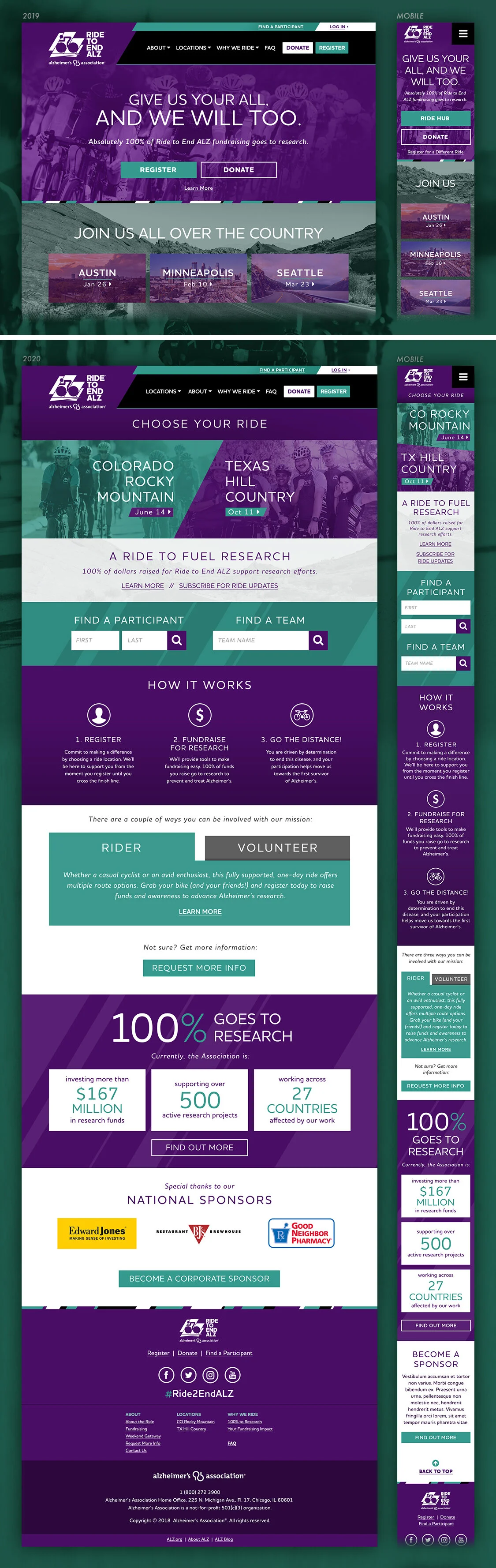
2019 and 2020 homepage designs. The main difference between the two designs was the top area of the page; going from multiple events to two.

Location homepage or “greeting” page (center), participant page (left), and participant fundraising center (right).
WIREFRAMES
Often non-profit clients don’t have the budget for wireframes, but they were important for a site like this. I’m glad we could do them initially in 2018. For 2019 I used physical wireframe sketches to communicate the changes (see below).
These are (admittedly) high fidelity wireframes that really helped us sell the idea of the event site to ALZ. I completed wireframes for the homepage, location homepage, and to show how the navigation and logged-in user menus would work (plus mobile layouts, of course!).
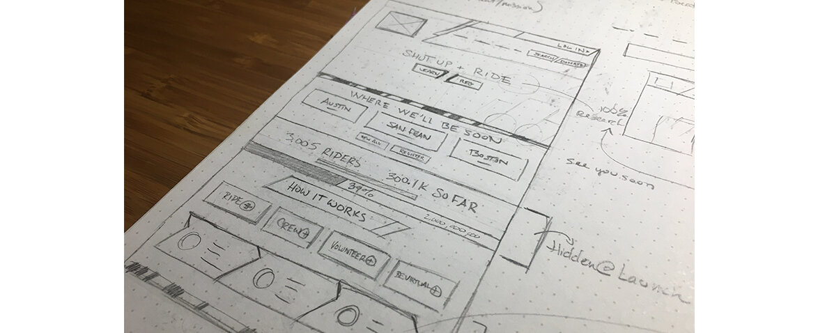
Homepage sketch for 2019 site.

Quick homepage sketch for proposed change to locations area in 2020.
EMAILS
A series of emails were written, designed, and scheduled for the Ride to End ALZ event. Initially the emails were to get the word out about the event, and directed the viewer to the site to register. Following emails were used to encourage registrants to fundraise, and also inform riders and team captains about relevant event details. Strategic Consultant: Colleen Legge
All emails were mobile-friendly.