80TH ANNIVERSARY: Branding
Twin Liquors celebrated their 80th anniversary in business in 2017, and I worked together with my department and account manager to create the myriad of promotional materials needed by the client. Included here are the parts of projects that were spearheaded by me: Logo, apparel, posters, and more.
The final 80th seal is on most 2017 advertising, alongside the Twin Liquors logo.
Some of my exploration for the 80th mark. Click here for a detailed look of the line art illustrated option.
Identity system made for the corporate office.
In-store danglers, front and back. (Originally the wooden look was for branded coasters, which got scrapped. The client liked the retro look, so we used it for these instead.)
Store door cling with the 80th seal artwork.
Shirts were screenprinted at Austin Screen Printing; I went for the press check. Both shirt designs have the 80th seal, small on the upper back. At the client’s request we had both phrases trademarked.
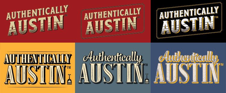
Exploration of tagline lockups and color schemes. The capitol dome/wine glass mark was considered too political, so it was removed from the final design.
Branded pet bandana with both brand marks. I included some boozy assets in the paisley pattern.
Branded trucker and baseball caps were created with both the “Authentically Austin” (pictured above) and “Authentically Texas” lockups.
Patch shape exploration for the Authentically Austin mark. Patches were for in-store giveaway, as well as used on the branded hats.
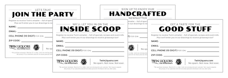
Refreshed in-store email acquisition flier. Additional copywriting options are pictured (all headlines written by me).
A series of posters were created for in-store display. 70 and 75th looks were refreshed from previous years’ celebrations. (70th/75th marks by David Ciccocioppo)
AGAVERAMA: Campaign
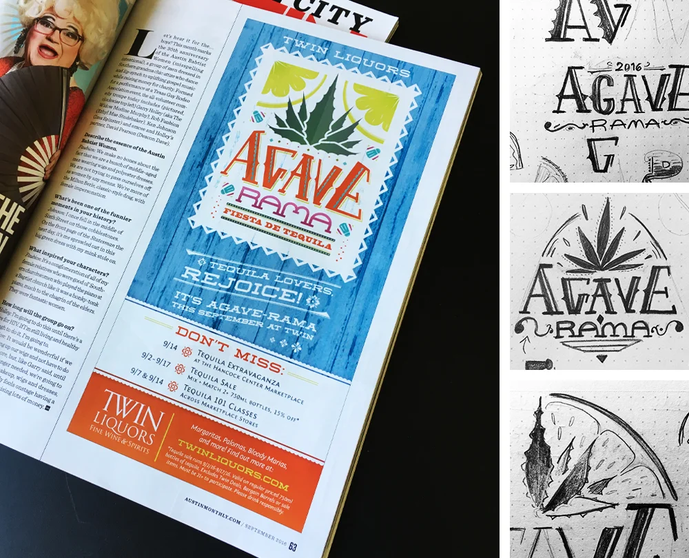
Bright, fun, attention-grabbing — Twin Liquors always has a promotion going on, and we wanted this one to stand out. Agaverama is their annual tequila promotion, so I included hints of papel picado and talavera ceramic tiles in the design. The tiny salt shakers in the design was one of my favorite touches.
The client loved the look, and it was used across store signage, and in the print and web campaign.
Process sketches of the Agaverama lockup (right), exploring overlapping the lime and agave shapes and custom typography.
Corresponding homepage rotator graphic.
SUMMER WINE SALE: Campaign
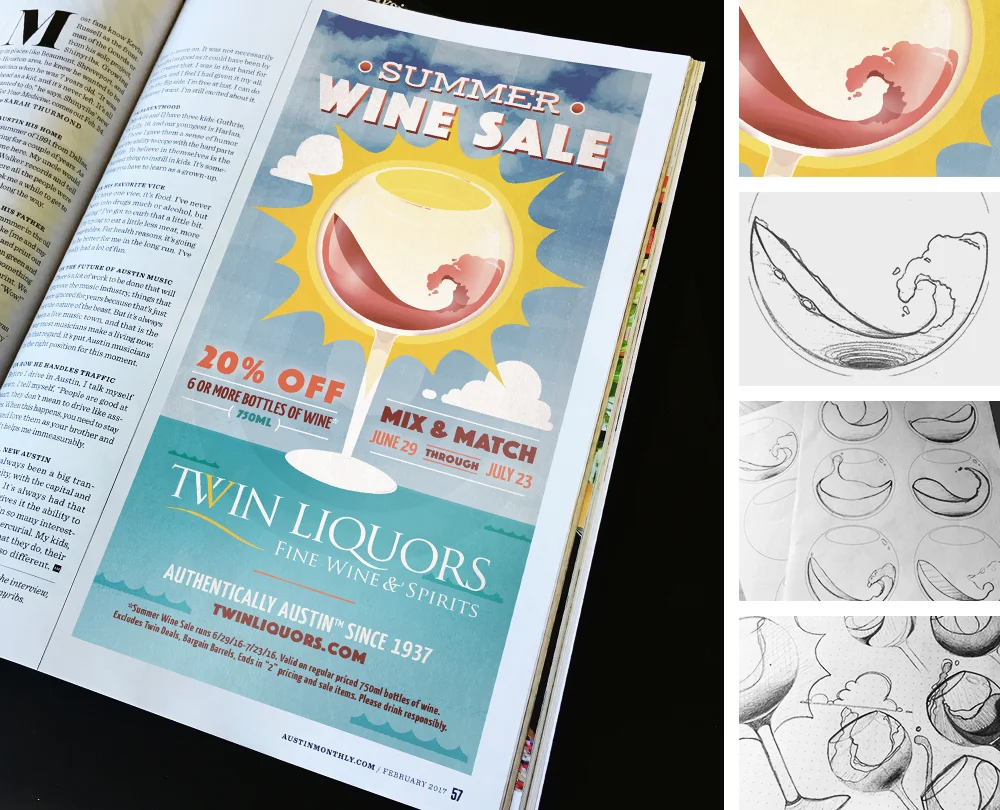
For this annual ad campaign I wanted to bring the viewer in by having an eye-catching and slightly visually-layered illustration, pulling together the summer-y imagery of the sun, waves, and rosé in a wine glass. The action of aerating a glass of wine often creates a wave shape in the glass, which was my inspiration. I also did a slightly washed-out color scheme to make it appear sun-bleached.
Process of custom illustration for Summer Wine Sale (right); wave shape process and detail shown.
Corresponding homepage rotator graphic.
WHISKEY DAYS: Campaign
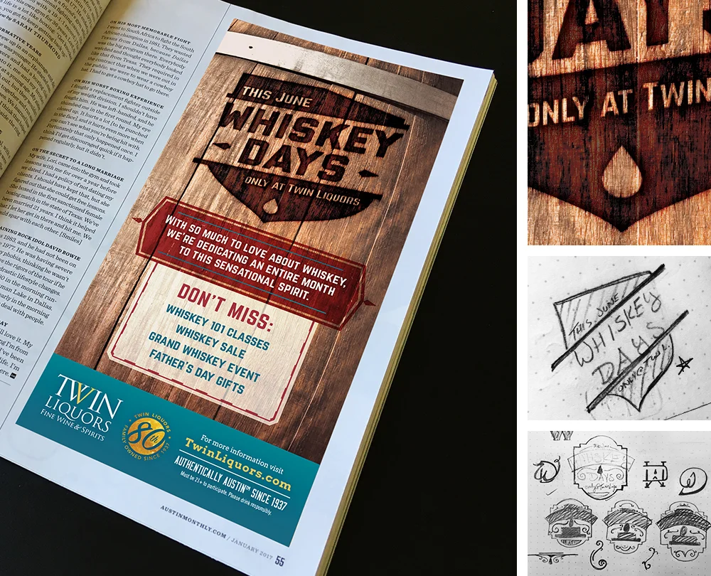
I created the look for 2016 (and remained in 2017) campaigns of the Whiskey Days sale. This mark went through many rounds as it is one of their bigger annual events. Below is the new 2017 campaign look, where I made a simplified and one-color version of my 2016 logo shield and "branded" it into the side of a whiskey barrel. It had to be a masculine theme overall since it also overlapped with their Father's Day events (using the same shield lockup, but replacing the copy).
Detail of wood burn look, and preliminary progress sketches for the Whiskey Days shield (right).
Corresponding homepage rotator graphic (along with the 80th logo I created).
FRENCH WINE SALE: Campaign
Below is the refreshed look for the 2016 annual French Wine Sale. This illustration is based on the previous years' campaign for this sale, which had a man riding the the opposite direction and a different color scheme. The idea for the refresh came from the marketing manager at Twin Liquors, and she said the illustration I created was exactly what she had in mind.
Detail of woman vector illustration (right).
Corresponding homepage rotator.
HOLIDAY WINE SALE: Campaign
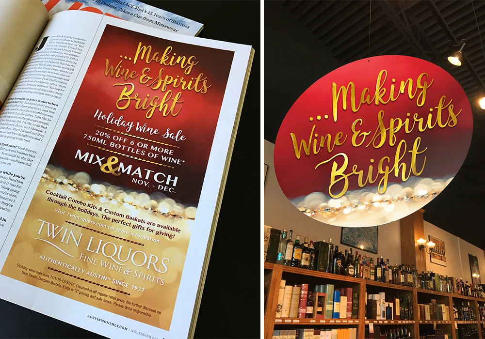
The creative department worked together to brainstorm many options for a tagline for the 2016 annual Holiday Wine Sale. We all independently came up with this concept, and coincidentally it was also the client's favorite tagline from the concepts we presented.
They requested a refined, modern look for that year’s holiday collateral. Designing the dangler first, I kept the color scheme limited (and subsequently stuck to the one-color Twin Liquors logo).
Print ad and in-store dangler.
FIESTA: Collateral
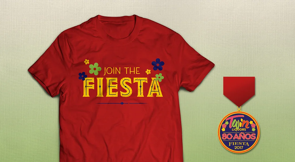
Twin Liquors has a presence at the Fiesta San Antonio festival every year. In addition to hosting a pre-party, they also create a branded Fiesta pin that they give away at their San Antonio locations. Fiesta medals are highly collectable.
Shirt design based on the chosen medal design (credit David Ciccocioppo). This shirt also has the 80th Seal on the back.
